


-
Recent Posts
Recent Comments
Archives
Categories
Meta
The plot of our movie is based on Roy Lichtenstein’s 1965 ‘Pop Art’ work “M-maybe.” Our story tells the tale of the man (played by Zach) that the girl (played by Ines) is referring to in the original art work. She is waiting for him to go on their date but, as we see in the sequence, he is absent since he leaves late from work and after a series of events must walk home. On his way there however, he comes across mysterious sunflowers on this very gloomy and rainy day. Could it be a sign from the heavens to get home to his lady love as quickly as possible? It very well could be, just as the slow decay of the bright flowers may be explained by his ultimate betrayal. #punishmentfromtheGods We used a series of moves and shots throughout the filming process, most of which are tilts, pans and close ups. 5 examples of framing shots: -over the shoulder shot when second flower seems to disappear -cut in shot of shoes falling on ground after jumping over fence -the medium shots of him running through the field and street with flower petals falling -point of view shot of flowers being offered -extreme close up of wilted flowers 3 examples of move types: – pan left as we see him run across the street from the gallery -tilt up when we see him following the first flower trail with his eyes – tracking front with the shot of him running down the street with flowers in his hand
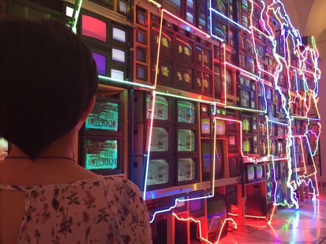
Its interesting to think that the artist of Electronic Superhighway was so old when he created his piece. Nam June Park was born in 1932 and moved to America in 1964. The piece was created in 1996 and was an ode to the vastness of America. Park was from South Korea originally. Park died in 2006. He is considered to be one of the original founders of video artwork. Park lived his life moving around the world. Originally him and his family moved to escape the Korean war. His family first moved to Hong Kong. Eventually they moved to Japan. Later in his life Park moved to West Germany to study.
The plot of our movie is based on Roy Lichtenstein’s 1965 ‘Pop Art’ work “M-maybe.” Our story tells the tale of the man (played by Zach) that the girl (played by Ines) is referring to in the original art work. She is waiting for him to go on their date but, as we see in the sequence, he is absent since he leaves late from work and after a series of events must walk home. On his way there however, he comes across mysterious sunflowers on this very gloomy and rainy day. Could it be a sign from the heavens to get home to his lady love as quickly as possible? It very well could be, just as the slow decay of the bright flowers may be explained by his ultimate betrayal. #punishmentfromtheGods We used a series of moves and shots throughout the filming process, most of which are tilts, pans and close ups. 5 examples of framing shots: -over the shoulder shot when second flower seems to disappear -cut in shot of shoes falling on ground after jumping over fence -the medium shots of him running through the field and street with flower petals falling -point of view shot of flowers being offered -extreme close up of wilted flowers 3 examples of move types: – pan left as we see him run across the street from the gallery -tilt up when we see him following the first flower trail with his eyes – tracking front with the shot of him running down the street with flowers in his hand
By Zach Ewell
Pitchfork music website recently underwent a major renovation. Personally I believe it is due to the site’s pursuit to stay relevant with Independent Music, in light of its commercial success. I the site’s change is a huge step down, and will hurt its image in the long run.

When you first enter the main page you are met with the name of the site complete with a few tabs under it. Below the tabs are pictures along with text previewing a story. Off the bat when it comes to the entire websites design it seems to be modeled after rectangular shapes. Although this rectangular theme does limit the site it makes it more repetitive. As you scroll down more and more stories pop up similar to a Facebook home page. When comparing the website to other Internet sites and mediums, the main page looks similar to a WordPress account, which is the platform of to many independent music blogs.
Although the new look of the website is definitely more organized, that doesn’t make it good. This website honestly looks like shit. The old website looked so much better. The old website featured more distinguishable colors and shapes that made it easier to navigate. Although the new website looks more clean in the sense of just featuring black, white, and gray colors, the website looks bland as a result.
As the viewer scrolls down the front page, rectangular design becomes disjointed as your eye moves left to right in a zig zag formation. If any thing the design makes the website look like a beta than a finished product.
In terms of what is unique about the website there is one huge interesting feature they have added. Now visitors of the website are able to listen to music that is featured and written about. This feature although dangerous in terms of corporate use, is also nice to have. It goes beyond the normal text of the critics. This feature blurs the lines of what the website actually is. On one hand the website is a music news outlet, and on the other end it is now a streaming service. The new feature also allows visitors to save songs and explore tracks similar.
Another aspect of Facebook that the new Pitchfork website holds its trending bar. In this section of the website viewers can look at top trending artists and significant artists per genera. This new option is interesting because it allows the website to dictate what artists are hot and not at the moment. Attached to the top six artists are recent stories by the website, which make up types of profiles.
When analyzing Pitchfork’s latest website update it makes sense to look at other music websites to understand the change. When analyzing the a newer and more independent music website FADER, the context of Pitchfork’s changes becomes more understandable. Featuring a similar rectangular design and color scheme, its easy to see that Pitchfork obviously took inspiration from FADER’s website.
Pitchfork’s Website: http://pitchfork.com
When the Star Wars The Force Unleashed poster first came out, it caused an uproar. Stylistically similar to the layout of an epic film and a star wars movie, Star Wars the Force Unleashed was the most anticipated film of 2015. As many began to pick it apart others took it in. I am still taking it in given that a copy is hung above my bedroom door.
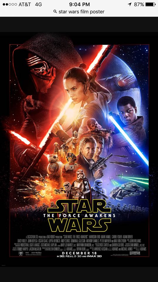
When putting an analyses to this poster there are a few things that make this picture preview visually pleasing. First off the poster has a slight use of the golden triangle. Using both Ren’s and Fin’s light sabers, they together both make a similar shape to the golden triangles. Who would have though Ren’s controversial weapon would end up playing a visual component. When adding Rey’s staff to run parallel with Ren’s light saber, the golden triangles become more apparent.
The placement of characters in this poster is key to foreshadowing their roll in the film and probably the trilogy. When the poster first came out people began to complain and question weather Luke Sky Walker was actually in the film. Which if you saw the film you would understand why he was not shown in the trailer. First off all three main characters Ren, Rey, and Fin are the largest on the poster and are featured on top of everyone else. I never noticed to now however All three are placed in a diagonal line, which also adds to the golden triangles effect. Bellow are the classic characters such as Chewy, Han, Leigh, C3PO and R2D2. And under the classic characters are some new characters such as BB8, Poe, Maz, and Fasma. And below all of those is an alignment of new storm troopers diagonally slanted towards the middle of the poster. Light also plays a key part to this poster. On the right side of the poster objects and people are tinted blue. Starkiller Base, Fin and the blue light saber all give off rays of blue. On the other end of the spectrum featuring Ren and Rey, everything is tinted red. Due to the red light saber and a few fires and sunlight (yes even JJ Abrams’s posters need lens flairs) all the characters on the right side are tinted reddish orange. Although visually pleasing these two opposing colors split the poster in half, similar to the dark side vs. the light. This separation of light also help infers that there will be a struggle fore power (and the galaxy) in the film.
Facial expressions are key to explaining a character’s personality at first sight. It is interesting to see Ren’s, Rey’s, and Fin’s faces and what directions they are facing. While Ren is facing off to the right of his body both Ren and Rey seem to be looking in the same direction. Because of Ren’s mask and our inability to see his eyes, it is impossible to see in what direction he is actually looking. Because of this flaw it can not be inferred that both Rey and Ren are on the same side.
This poster is absolutely amazing and will easily go down in history as one of eh most iconic movie posters of the 21st century.
